昨天一个项目,在一个密码提示框出,要hover一个聊天框出来,聊天框上是有三角形的,之前好像也写过,但当时直接搜的样例用了,没太搞清楚空心三角形怎么写的。今天闲下来,就把这一小块知识梳理一下。
·············
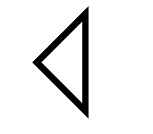
首先,空心三角形的思路是:用before伪类写一个实心三角形,再用after写一个小一圈的三角形覆盖上去,留下边缘,形成空心三角的视觉效果(好想说“形成这样一个triangle的Visual effect”,现在程序员说话不蹦几个English words好像都不好意思开口,真是奇怪的文化;开会时,更新、跟进不说更新,都说“我们来update一下”,,老铁666)。
dom:
1 2
| <div class="arvin-triangle"> </div>
|
css:
注释掉div本身是因为,需求是写聊天框
类似于

此处我为了练习直接表现了一个三角形。
1 2 3 4 5 6 7 8 9 10 11 12 13 14 15 16 17 18 19 20 21 22 23 24 25 26 27 28 29 30 31
| .arvin-triangle{ /*width: 125px; height: 40px;*/ position: relative; background-color: red; /*border: 1px solid black;*/ margin-left: 50px;/* just for visual effect,no special significance */ } .arvin-triangle:before{ content: ''; position: absolute; top: 10px; left: 10px; width: 0; height: 0; border-right: 110px solid black; border-bottom: 110px solid transparent; border-top: 110px solid transparent; } .arvin-triangle:after{ content: ''; position: absolute; top: 40px; left: 28px; width: 0; height: 0; border-right: 80px solid white; border-bottom: 80px solid transparent; border-top: 80px solid transparent; }
|
P.s
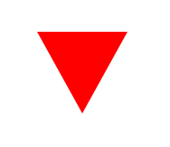
实心三角形,就直接用div的边写出来。
1 2 3 4 5 6 7 8 9 10 11 12 13
| <style> #triangle-up { width: 0; height: 0; border-left: 50px solid transparent; border-right: 50px solid transparent; border-top: 90px solid red; margin: 50px; } </style> <div class="" id="triangle-up"> </div>
|
